
How to make Flutterflow bottom navigation bar step by step guide
A bottom navigation bar in FlutterFlow ensures a smoother, more delightful page-switching experience.
This feature revolutionizes how users interact with your pages by introducing easily accessible, clickable buttons at the bottom of the screen.
In this guide, we’ll take you step by step through the process of adding the FlutterFlow bottom navigation bar to your app’s pages, all in just three minutes.

Note: You can choose to use FlutterFlow’s custom navigation or build your own with widgets. in this tutorial we will dive into using FlutterFlow’s native navigation bar and all its styling options available
Using FlutterFlow Native NavBar
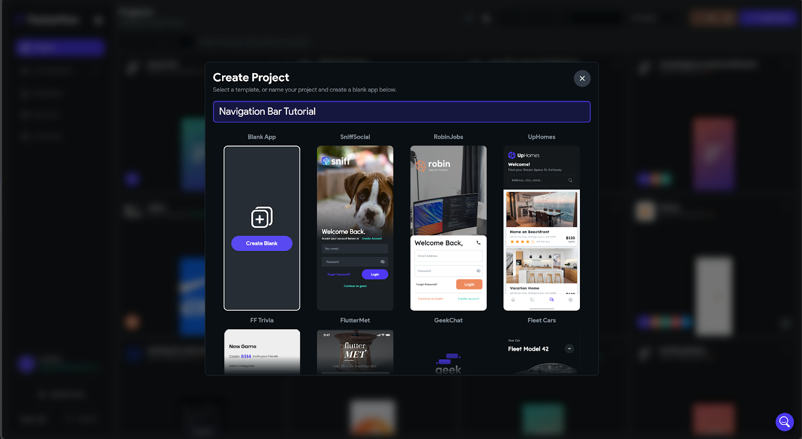
Step one – Create a New Flutterflow Project:
Begin by logging into your FlutterFlow account and initiating a new project. For this tutorial we are going to start a project from scratch.
Step two – Configuring Project Settings:
Navigate to App Settings > General > Nav & App Bar to configure your project settings. Here, you can enable and customize the settings of your Nav bar.

Step Three: Enabling NavBar
To activate the NavBar, follow these simple steps:
- Toggle On the NavBar: Enable the NavBar functionality by turning on the Show NavBar toggle.
- Responsive Visibility Configuration (Optional): If you’re creating a responsive application for mobile, tablet, and web, you can fine-tune NavBar visibility.
Configure the responsive visibility settings to determine on which platforms or screen sizes the NavBar should remain hidden.
For instance, if you wish to exclude the NavBar from the desktop and tablet landscape mode, simply uncheck or tick off these options.
In the following example, we demonstrate how to make the NavBar invisible on desktop and tablets in landscape mode. Adjust these settings according to your application’s responsiveness requirements.


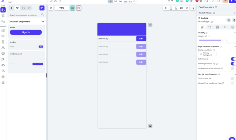
Step four: Adding Pages to NavBar
Before delving into the process of configuring NavBar items, it’s essential to ensure that your project has a minimum of two pages for the NavBar to function correctly. Follow these steps:
- Create Pages: Begin by creating at least two pages within your project.

- Adding Navbar to your pages
With a minimum of two pages in your project, proceed to configure NavBar items.
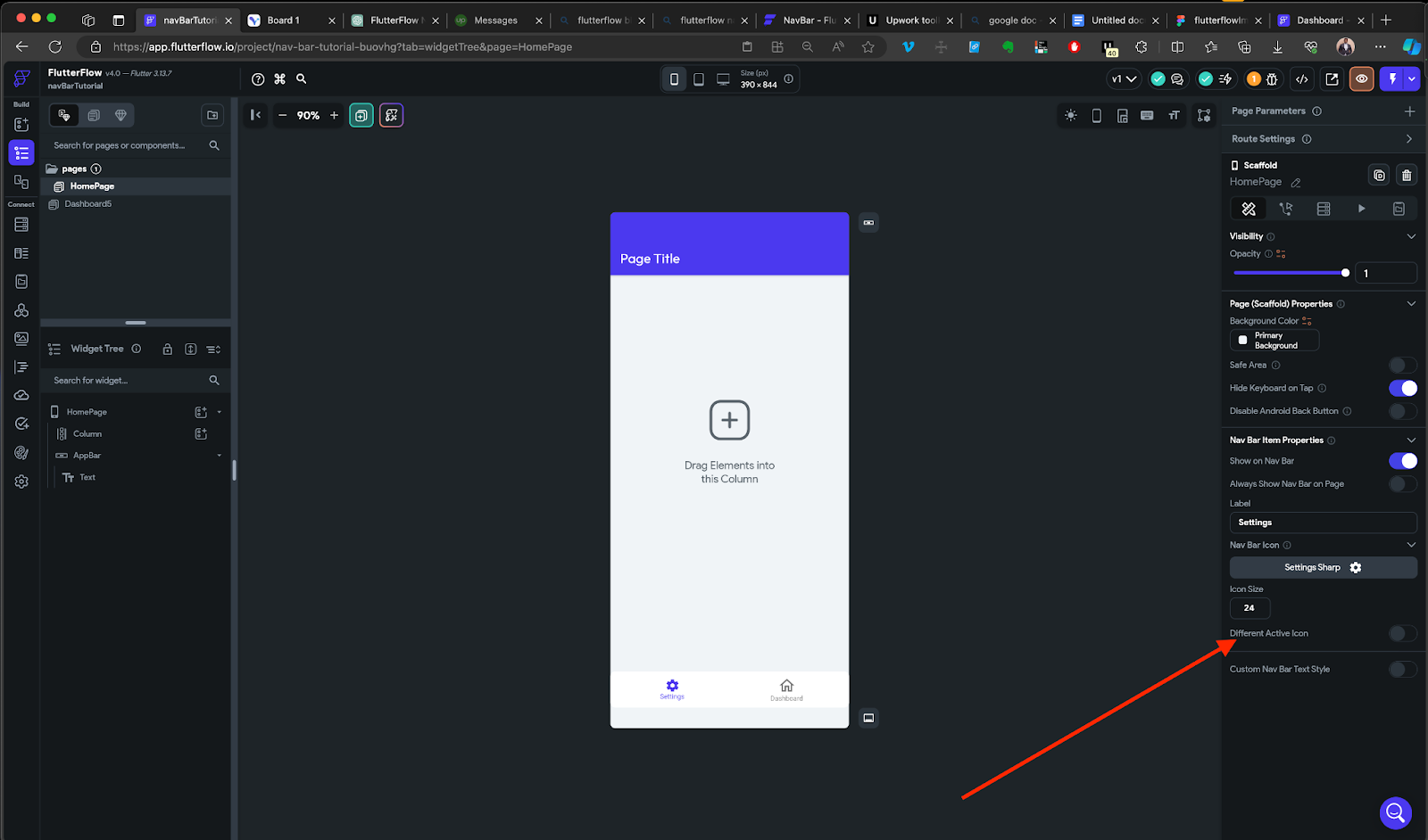
Open the specific page you wish to include in the NavBar.
Navigate to the Properties Panel > Nav Bar Item Properties.
Toggle on the Show this page on the NavBar switch.

Assign a meaningful label and select an appropriate icon for each page.
Additional Settings: Explore other customization options for an enhanced NavBar experience:
- App Icon Size: Adjust the size of the app icon displayed when the NavBar is active.
- Different App Icon When NavBar is Active: Optionally, configure a distinct app icon to appear when the NavBar is active by toggling the option. This feature adds a dynamic touch to your app’s appearance.
Step five- Changing NavBar Style and Layout
- Select NavBar Style: Navigate to App Settings > General > NavBar & AppBar > Layout/ Styling. Choose the desired NavBar layout from the Nav Bar Style dropdown or configure the label options, navbar color, selected color and unselected.
Layout Options: FlutterFlow’s NavBar offers a range of layout styles to enhance your app’s aesthetics. Explore the following layout styles in the Nav Bar Style dropdown:
Flutter Default Nav Bar:

This is like the classic, default style that many apps use. It’s clean, simple, and follows the standard design principles. You have the option to decide if you want labels (names) to show up for the selected and unselected items in your navigation bar.
Google Nav Bar:

Imagine the sleek and modern navigation you see in Google’s apps. That’s the Google Nav Bar style. It adds a touch of contemporary design to your app. When you select an item, a subtle animation reveals the name of the page, offering a stylish and engaging user experience.
Floating Nav Bar:

Picture a navigation bar that doesn’t sit at the bottom but gently floats above your app’s content. The Floating Nav Bar is a trendy choice. It displays labels for all items in the NavBar, ensuring a seamless and visually pleasing navigation experience. It’s like having your navigation effortlessly glide over your app’s pages.
Step six – Customizing NavBar Appearance
Now that you’ve set up the NavBar let’s dive into customizing its appearance to match your app’s design. For example, You can customize the NavBar to show a different icon when the item is selected or change the overall appearance of the NavBar.
- Showing a Different Icon When Selected: You can customize the appearance of icons when they are selected which adds a dynamic touch to your app. Navigate to the specific page you want to customize the Nav Icon, move to the Properties Panel > Nav Bar Item Properties Activate the Different Active Icon option to enable customization for the active state then choose a new icon that resonates with the selected state of the item.
- Changing Label Text Style: Customizing the text style of labels in your navigation bar allows you to infuse a personalized and cohesive design into your app. Follow these steps to customize the label style of your navigation bar.

Open each page, go to Properties Panel > Nav Bar Item Properties, and turn on the Custom Nav Bar Text Style toggle. Modify the text style to your liking.
– Note: This setting is only applicable if you have set the Nav Bar style to either Google Nav Bar or Floating Nav Bar.
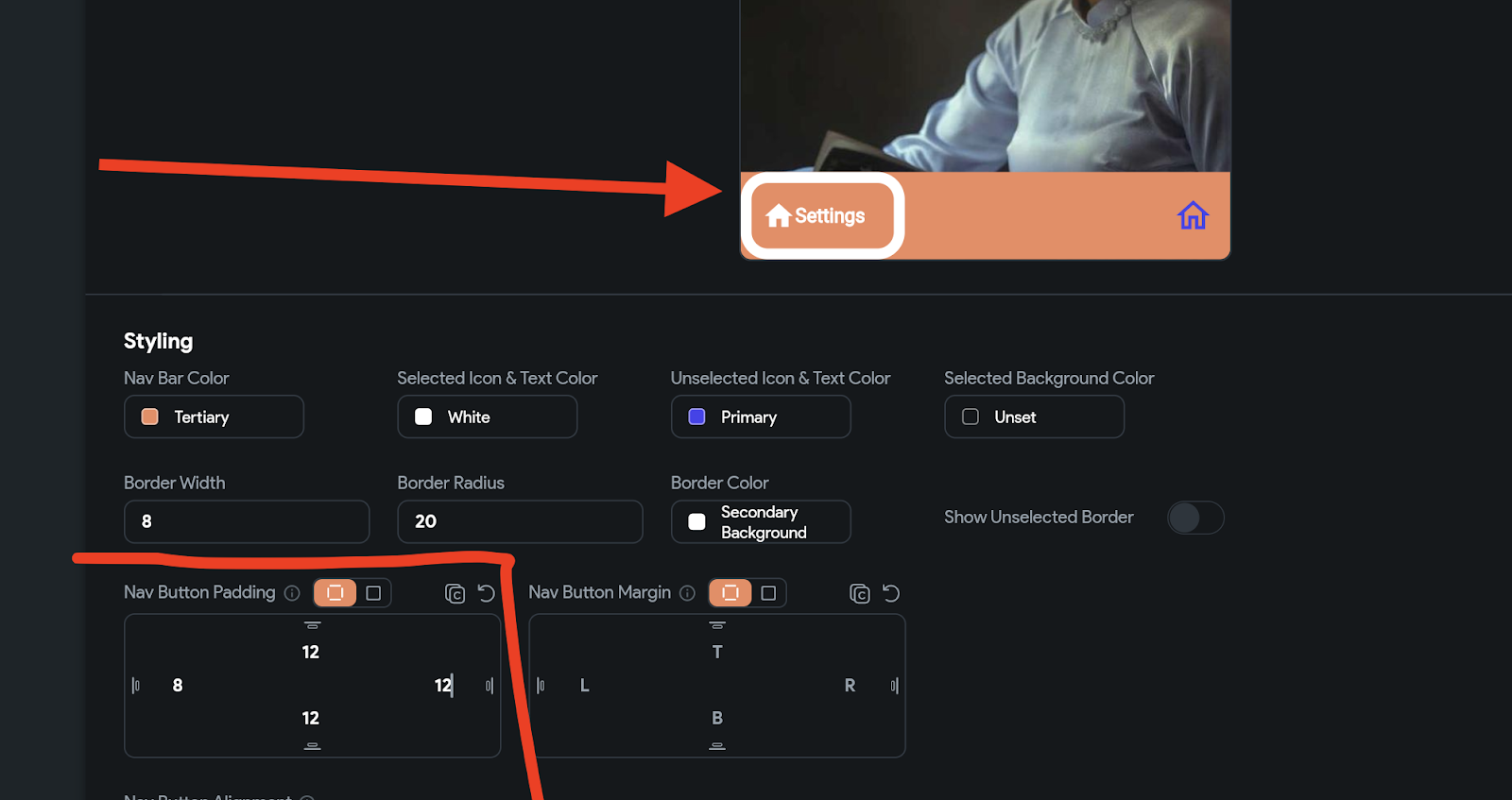
- Changing Nav Button Color: You can modify the color of Navigation Buttons (Nav Buttons) in your NavBar and it is a great way to add vibrancy and visual appeal to your app’s navigation.
Open each page, go to App settings > Nav Bar & App Bar > Styling Properties, and customize the NavBar Button Color and its gradient if desired.
You can customize the NavBar Background Color, the icon and text color, icon and text color (unselected) and the selected background color. In the example below the navbar background has been set to a dark shade of orange with the navbar styling option.


- Additional styling options based on choice of layout style:
You can toggle between different settings based on your layout option of choice, Flutter Default Nav Bar, The Google NavBar and the Floating Nav Bar. This will allow you to customize the default appearance of the Nav Bar layout using the various properties available under the Nav Bar Display Settings.
Customizing Flutter Default Nav Bar
Show or hide labels:
To show/hide labels for selected and unselected items:
- Navigate to the App settings > General > NavBar & AppBar > Nav Bar.
- Scroll down to the Styling section.
- To show/hide labels for the selected item, turn on/off Show Labels (Selected) toggle.
- To show/hide labels for unselected items, turn on/off Show Labels (Unselected) toggle.


Changing icon color
To change the icon color for selected and unselected items:
- Navigate to the App settings > General > NavBar & AppBar > Nav Bar.
- Scroll down to the Styling section.
- Change the color using the Selected Icon Color and Unselected Icon Color.

Customizing Google Nav Bar
1. Changing icon and text color:
To change the icon and text color for selected and unselected items
- Navigate to the App settings > General > NavBar & AppBar > Nav Bar.
- Scroll down to the Styling section.
- Change the icon and text color using the Selected Icon & Text Color and Unselected Icon & Text Color properties.

2. Changing selected item background color
You can also add the background color around the selected item. Here’s how you do it:
- Navigate to the App settings > General > NavBar & AppBar > Nav Bar.
- Scroll down to the Styling section.
- Change the color using the Selected Background Color property.
3. Showing a border
To display a border with the google navbar settings:
- Navigate to the App settings > General > NavBar & AppBar > Nav Bar.
- Scroll down to the Styling section.
- Set the color using the Border Color property (make sure you set the Border Color property to a color that is not the same as the NavBar background color to see it clearly).
- Now to edit the border width, find the Border Width property below and enter the value.
- To adjust the rounding corners, find the Border Radius property and enter the value. (e.g.8,10,50). To remove the rounded corners, set it to 0.
- To show the same border for the unselected items, turn on the Show Border for Unselected toggle.

4. Add Nav Button padding & Margin
With Google NavBar, the Nav Button (item inside the Nav Bar) looks pretty tiny. However, you can change the default size by adding a Nav Button padding value, which increases the Nav Button’s size.
To add Nav Button padding:
- Navigate to the App settings > General > NavBar & AppBar > Nav Bar.
- Scroll down to the Styling section.
- Find the Nav Button Padding and enter the values.
To add margin:
- Navigate to the App settings > General > NavBar & AppBar > Nav Bar.
- Scroll down to the Styling section.
- Find the Nav Button Margin and enter the values.
5. Changing Nav Button alignment
Changing the Nav Button alignment will change how the Nav Buttons are horizontally distributed inside the NavBar.
To change the Nav Button Alignment
- Navigate to the App settings > General > NavBar & AppBar > Nav Bar.
- Scroll down to the Styling section.
- Find the Nav Button Alignment dropdown and select from the options that include Start, Center, End, Space evenly, Space between, and Space around.
You can play with the options to see which style you prefer.

6. Adding space between icon and text & Changing animation duration
You can seamlessly control the spacing between icons, text, and animation duration in your Google NavBar layout.
Fine-Tuning Spacing and Animation Duration:
- Access NavBar Settings:
Navigate to App settings > General > NavBar & AppBar.
Locate the Animation Duration (ms) property and consider adjusting it to 2000 ms. In practical terms, this translates to a 2-second completion for the animation.

Icon and Text Spacing settings:
- Navigate to the Setting and Integrations > General > NavBar & AppBar > Nav Bar.
- Scroll down to the Styling section.
- Find the Gap Between Icon and Text property and enter the value (e.g., 5, 10, 15).

7. Enabling haptic feedback
When a user taps a navigation bar item, haptic feedback can signal (via vibration) that the tap was registered successfully. This can make the app feel more intuitive and responsive.
To change enable the haptic feedback:
- Navigate to the Setting and Integrations > General > NavBar & AppBar > Nav Bar.
- Scroll down to the Styling section.
- Turn on the Haptic Feedback toggle.

Customizing Floating Nav Bar
When the NavBar style is set to the Floating Nav Bar, you can change the default appearance of the Floating Nav Bar using the various properties available under the Nav Bar Display Settings.
1. Changing icon and text color
To change the icon and text color for selected and unselected items:
- Navigate to the Setting and Integrations > General > NavBar & AppBar > Nav Bar.
- Scroll down to the Styling section.
- Change the color using the Selected Icon & Text Color property.
- Similarly, to change the icon and text color for the unselected items, find the Unselected Icon & Text Color property and change the color.
2. Changing selected item background color
With Floating Nav Bar Style, you can also add the background color around the selected item.
To add/change the background color for the selected item:
- Navigate to the Setting and Integrations > General > NavBar & AppBar > Nav Bar.
- Scroll down to the Styling section.
- Change the color using the Selected Background Color property.

3. Changing NavBar width
You might want to change the default NavBar width (i.e., full width) to make the NavBar look floating over the page.
To change the NavBar width:
- Navigate to the Setting and Integrations > General > NavBar & AppBar > Nav Bar.
- Scroll down to the Styling section.
- Find the Width property. There are three ways to set width:
- To set to an exact size, select PX and enter the desired values.
- To set the dimensions as a % of the screen size, select % and enter the desired value.
- To make the width of the NavBar back to the screen’s width, just click on the infinity icon

4. Add Nav Button padding
Adding a Nav Button Padding creates an empty space around the Nav Button.
To add Nav Button padding:
- Navigate to the Setting and Integrations > General > NavBar & AppBar > Nav Bar.
- Scroll down to the Styling section.
- Find the Nav Button Padding and enter the values. Tip: Click on the Refresh icon to reset the values.
To see the space created by entering the padding value, try changing the selected item background color.
5. Add Nav Button margin
Adding a Nav Button margin creates an empty space around the NavBar.
To add Nav Button margin:
- Navigate to the Setting and Integrations > General > NavBar & AppBar > Nav Bar.
- Scroll down to the Styling section.
- Find the Nav Button Margin and enter the values. Tip: Click on the Refresh icon
to reset the values.

6. Changing border radius
Changing Border Radius allows you to adjust the rounded corners of the NavBar and Nav Button.
To change the Border Radius:
- Navigate to the Setting and Integrations > General > NavBar & AppBar > Nav Bar.
- Scroll down to the Styling section.
- For NavBar, find the Border Radius property and enter the value (e.g., 0,20,5,0).
- For Nav Button, find the Button Border Radius property and enter the value.
- To remove the rounded corners, set the Border Radius 0.
To see the effect of changing the Border Radius, try changing the selected item background color.

6. Changing elevation
To change the elevation (depth or Z-axis) of the NavBar
- Navigate to the App settings > General > NavBar & AppBar > Nav Bar.
- Scroll down to the Styling section.
- Find the Elevation property and enter the value.
Conclusion
Congratulations! You’ve mastered the art of creating and customizing Navigation Bars in FlutterFlow.
From setting up a new project to fine-tuning the NavBar’s appearance, you now have the tools to build a visually appealing and user-friendly mobile app.
Experiment with different styles and configurations to discover the perfect navigation experience for your FlutterFlow project. Happy coding!